A Simple, Friendly Guide to Hue, Saturation & Luminance
Colour editing can feel overwhelming when you’re just starting out, but it doesn’t have to be. This guide uses a simple ice‑cream metaphor to help you understand Hue, Saturation and Luminance in a way that actually sticks.
Understanding these three elements gives you gentle, reliable control over the colours in every image you edit.
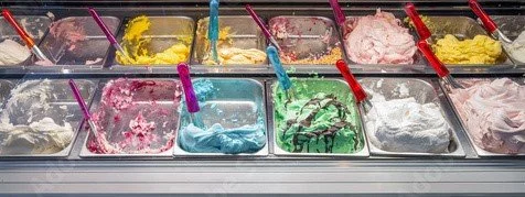
🍨 Seeing Colour Through Ice Cream
Hue, Saturation and Luminance (HSL) become much easier to grasp when you imagine you’re at the ice cream counter.
• Hue = the flavour
Strawberry, mint, chocolate — the basic identity of the colour.
• Saturation = how strong the flavour is
A light hint or a full, bold scoop.
• Luminance = how much cream you add
More cream makes it lighter; less makes it deeper and richer.
Three simple ingredients that explain every colour you work with.
A colour image removing colour from all channels except blue and red.
🎨 Hue — The Flavour Itself
If colour were ice cream, hue is simply the flavour you pick.
Choosing strawberry, mint, chocolate or vanilla isn’t about strength or brightness — it’s about the identity of the colour. Hue is present in red, blue, green, yellow (the basic colour wheel), and every colour in between. It doesn’t change intensity (that’s Saturation) or brightness (that’s Luminance). It’s the base you start from before anything else is adjusted.
Hue is the foundational choice — the starting point for everything that follows.
🍧 Saturation — How Strong the Flavour Tastes
If hue is the flavour, saturation is how intensely that flavour comes through.
Imagine ordering mint ice cream. Saturation decides whether it tastes like a bold, punchy mint explosion… or a gentle, almost‑vanilla whisper with just a hint of mint hiding in the background.
In colour terms, saturation controls the purity of the hue:
• High saturation — full‑strength flavour, vivid and unmistakable
• Low saturation — watered‑down flavour, softer, subtler, closer to grey
You’re not changing the flavour itself — you’re deciding how strongly it hits your senses.
🔆 Luminance — How Much Milk or Cream You Add
Luminance is all about how light or dark a colour appears, and in our ice‑cream metaphor, it’s the amount of milk or cream mixed into the base.
Take that same mint flavour:
• More cream → lighter, softer, almost pastel
• Less cream → deeper, richer, more intense
The flavour (hue) stays the same.
The strength of the flavour (saturation) stays the same.
What changes is the brightness — the overall lightness or darkness of the colour.
Luminance shifts a colour toward airy pastels or deep moody tones without ever changing what the colour is.
🍦 Bringing It All Together
Once you see colour through the lens of ice cream, HSL becomes intuitive:
• Hue chooses the flavour
• Saturation decides how strong it tastes
• Luminance controls how light or deep the scoop becomes
This is why HSL is such a powerful tool in photography: it lets you adjust the emotional flavour of your images with precision, without breaking the natural relationships between colours.
Try opening one of your images and adjusting just the Hue, Saturation and Luminance of a single colour. Small, curious experiments build confidence quickly.